
A correct U.S. copyright notice for a logo contains exactly three elements: the © symbol (or the word “Copyright” or the abbreviation “Copr.”), the year of first publication, and the name of the copyright owner. That’s it. Under 17 U.S.C. § 401, those three pieces are all the law requires.
Here are copy-ready examples you can use right now:
© 2026 Meridian Studio LLC(corporate owner)© 2026 Jane Ortega(individual designer)Copyright 2026 Brightline Co.(word form, equally valid)Unpublished work © 2026 Jane Ortega(internal draft, not yet published)
Notice has been optional for works published on or after March 1, 1989, but skipping it costs you. Under 17 U.S.C. § 504, pairing a visible notice with federal registration supports statutory damages up to $150,000 for willful infringement. An infringer who saw your notice cannot claim they didn’t know the work was protected. That defense disappears the moment © is on the file.
Table of Contents
- What goes into a valid U.S. copyright notice?
- Ready-to-paste notice templates for logos
- How do you type or embed the © symbol?
- Where should the notice sit on or near a logo?
- © vs. ™ vs. ®: which symbol belongs with your logo?
- Does your notice survive mobile and small screens?
- How to keep your notice consistent across every file and platform
- Tools and resources that make this faster
- Key Takeaways
- Why subtle, consistent placement is the real discipline
- Copyrighttoolkit has the symbol ready when you need it
- Useful sources
What goes into a valid U.S. copyright notice?
Each of the three required elements has practical choices worth knowing.

| Element | Options | Notes |
|---|---|---|
| Symbol or word | ©, “Copyright”, “Copr.” | All three are legally equivalent; © is the most universally recognized |
| Year | Year of first publication | Use the year the logo was first distributed publicly, not the creation date |
| Owner name | Full legal name, business name, or known abbreviation | “Meridian Studio LLC” and “Meridian Studio” are both acceptable if the abbreviation is widely known |
Element 1: Symbol or word. The circled C (©) is the standard choice. The word “Copyright” and the abbreviation “Copr.” are full legal equivalents under U.S. Copyright Office Circular 3, so use whichever fits your design context. One thing to avoid: typing (c) in parentheses. It is not a recognized legal substitute for the actual © symbol or the spelled word.

Element 2: Year of first publication. “First publication” means the first time you distributed the logo publicly, whether on a website, a product, or a press release. If you redesigned an existing mark, use the year the updated version was first published, not the original mark’s year. For a compiled set of logo variants released together, a single year covers the whole set.
Element 3: Owner name. Use the name that holds the rights. For a freelance designer who retains ownership, that’s your own name. For a business that commissioned the work under a work-for-hire agreement, it’s the company’s legal name.
From U.S. Copyright Office Circular 3: “The notice for visually perceptible copies shall contain all of the following three elements: (1) the symbol © (the letter C in a circle), or the word ‘Copyright,’ or the abbreviation ‘Copr.’; (2) the year of first publication of the work; (3) the name of the owner of copyright in the work.”
Ready-to-paste notice templates for logos
Pick the template that matches your situation and drop it into your file, footer, or image caption.
| Template | Best for |
|---|---|
© 2026 [Your Name] |
Solo designer retaining ownership |
© 2026 [Company Name] LLC |
Corporate-owned logo |
Copyright 2026 [Company Name] |
When © symbol may not render in plain text |
Copr. 2026 [Company Name] |
Abbreviated form in tight layouts |
Unpublished work © 2026 [Your Name] |
Internal drafts and mockups not yet released |
© 2024–2026 [Company Name] |
Compilation or updated mark (range shows revision history) |
© 2026 [Company Name]. All rights reserved. |
Web footers and formal brand documents |
© 2026 [Your Name] for [Client Name] |
Work-for-hire where credit is shared by agreement |
A few notes on the range format: use a year range only when you are indicating a compilation or a series of updates, not simply because time has passed. A logo first published in 2024 and unchanged since then carries © 2024, not © 2024–2026. The range signals that new material was added in the later year.
For internal-only drafts, the “Unpublished work” prefix signals that the piece has not been publicly distributed, which matters if a dispute ever arises about when rights attached.
When selling logo files through a digital marketplace, include the notice in both the delivered file and the product listing description so buyers see it before and after purchase.
How do you type or embed the © symbol?
Getting the symbol right matters. Here’s how to insert it on every major platform.
| Platform | Method | Result |
|---|---|---|
| Windows | Hold Alt, type 0169 on numeric keypad | © |
| macOS | Press Option + G | © |
| iOS / Android | Long-press the C key, select © | © |
| HTML (named entity) | © |
© |
| HTML (numeric entity) | © (HTML entity for © symbol) |
© |
| Unicode code point | U+00A9 (Unicode for © symbol) | © |
| Windows emoji keyboard | Win + ., search “copyright” | © |
| macOS emoji keyboard | Control + Command + Space, search “copyright” | © |
You can also copy the © symbol directly from Copyrighttoolkit’s dedicated symbol page, which works on any device without memorizing a shortcut.
In image and design software: add the copyright notice as an editable text layer in Illustrator, Photoshop, Figma, or Affinity Designer. Keep it editable for as long as possible. Flatten it into the artwork only for final export, and only when the format requires it. For PDFs, embed the notice in the document metadata (File > Properties > Description in Acrobat) in addition to the visible text layer. Metadata alone is not sufficient — placement must be reasonably visible to an ordinary user.
One font caveat worth knowing: some display fonts lack a properly mapped © glyph. If the symbol renders as a box or a fallback character, switch to a system font for the notice text, or use the HTML entity in web contexts. Checking font glyph support before final export prevents an embarrassing gap in your notice.
Where should the notice sit on or near a logo?
Placement is about making the notice findable, not decorative.
- Footer of the page or document is the most common and cleanest option for web and print. It keeps the notice off the mark itself while remaining visible to anyone who looks.
- Lower-right corner of the composition works well for standalone logo files, product mockups, and social media assets where no footer exists.
- Immediately adjacent to the logo (right side or below) is appropriate when the logo appears in isolation on a document cover or a brand sheet.
- Avoid placing the notice over the logo artwork itself unless the design genuinely has no other option. Overlaying text on the mark creates visual noise and can obscure the design.
For sizing, typographic best practice calls for baseline placement at the x-height of the surrounding text. If your body text is 10pt, the notice sits at roughly 7–8pt. Never superscript the © symbol in a logo notice — that’s a footnote convention, not a legal one, and it makes the notice harder to read at small sizes.
Color contrast matters too. The notice text should meet at least a 4.5:1 contrast ratio against its background so it remains legible when printed or displayed at reduced sizes.
Pro Tip: Keep the © notice in a neutral, secondary color from your brand palette. It should be readable but not compete with the logo itself. Think of it as a caption, not a design element.
© vs. ™ vs. ®: which symbol belongs with your logo?
These three symbols do different jobs, and using the wrong one sends the wrong signal.
The practical rule: © protects the artistic expression of a logo design. ™ and ® protect the logo as a brand identifier in commerce. A logo can carry both, and often should.
| Symbol | What it signals | When to use it |
|---|---|---|
| © | Copyright in the original artwork | Always, when you own the design rights |
| ™ | Trademark claim, unregistered | When you’re using the logo as a brand mark but haven’t registered it yet |
| ® | Registered federal trademark | Only after the USPTO grants registration |
Copyright and trademark symbols serve distinct functions: © covers the artistic design; ™ and ® cover the brand-source function. A designer who creates a logo and retains ownership should display ©. The business that uses that logo as its brand identifier should display ™ (or ® once registered). When the same entity holds both rights, displaying both symbols is entirely appropriate and provides layered notice.
For guidance on when to use ™ versus SM, Copyrighttoolkit’s TM vs. SM guide covers the distinction clearly. For typing ®, the registered trademark symbol page has keyboard shortcuts for every platform.
Does your notice survive mobile and small screens?
A notice that disappears at 375px wide fails its purpose just as surely as one that was never there.
- Test at 320px width. That’s the smallest common mobile viewport. If your footer notice wraps awkwardly or drops below the fold, adjust the font size or line length.
- Maintain a minimum font size of 9px for the notice text in web contexts. Below that, most users can’t read it without zooming.
- Check contrast on dark-mode displays. A light-gray notice on a white background that looks fine in light mode may disappear entirely when the OS switches to dark mode.
- Add the notice to alt text or a nearby caption for logo images. Screen readers won’t read text embedded in a raster image, so include the notice in the
altattribute or in an adjacent<figcaption>. - Use HTML text, not image text, for notices in web footers. HTML text scales, reflows, and is machine-readable. An image of the notice is invisible to assistive technologies and search engines.
| Context | Recommended approach |
|---|---|
| Web footer | HTML text, minimum 9px, 4.5:1 contrast |
| Logo image (raster) | Include notice in alt text or figcaption |
| Logo image (SVG) | Embed notice as a <text> element inside the SVG |
| PDF document | Visible text layer plus document metadata |
| Print collateral | Minimum 6pt, placed outside the bleed area |
Inconsistent notice placement across breakpoints can defeat the notice’s purpose. A notice that appears on desktop but vanishes on mobile is not a consistent public claim.
How to keep your notice consistent across every file and platform
Drop these rules into your brand guidelines and you won’t have to think about it again.
The consistency principle: a copyright notice only works as a public claim if it appears the same way, every time, on every version of the asset. One missing notice on a widely distributed file can complicate enforcement later.
| Rule | What it means in practice |
|---|---|
| Single canonical notice string | Decide on one exact wording (e.g., © 2026 Meridian Studio LLC) and use it verbatim everywhere |
| Master file naming | Name master files with the year: logo-primary-2026-master.ai |
| Export checklist | Every export gets the notice verified before delivery |
| Metadata habit | Embed owner name and year in file metadata on every save |
| Year update trigger | Update the year only when new material is first published, not on January 1 |
For file management, keep a brand asset manifest — a simple spreadsheet listing each logo file, its first publication date, the notice string used, and the last export date. When a client asks “which version is current?” you have a one-line answer.
Tools and resources that make this faster
Copyrighttoolkit offers several resources that remove the friction from this process entirely.
From Copyrighttoolkit’s symbol tools: the copy-paste © page gives you the symbol in one click, with keyboard shortcuts for Windows, macOS, and mobile displayed alongside it — no memorization required.
The © symbol copy-paste tool is the fastest way to grab the character on any device. The book copyright page templates show how to structure a full copyright page, which translates directly to brand documentation and asset delivery packets. For trademark symbols, the ® symbol guide covers every platform shortcut.
For the underlying law, the two primary sources are U.S. Copyright Office Circular 3 and 17 U.S.C. § 401. Both are free, authoritative, and short enough to read in under ten minutes.
Key Takeaways
A valid U.S. copyright notice for a logo requires the © symbol (or “Copyright”/“Copr.”), the year of first publication, and the owner’s name — and placing it consistently across every file and platform is what makes the notice legally meaningful.
| Point | Details |
|---|---|
| Three required elements | © symbol (or word/abbreviation), year of first publication, and owner name per 17 U.S.C. § 401 |
| Notice is optional but valuable | Post-1989 works don’t require notice, but it blocks innocent infringement claims and supports statutory damages |
| Placement must be visible | Footer, lower-right corner, or adjacent to the logo; hidden or mobile-only notices can fail their purpose |
| © and ™/® serve different roles | © covers artistic expression; ™/® cover brand-source use — both can appear on the same logo |
| Copyrighttoolkit | Use the copy-paste © tool and notice templates at Copyrighttoolkit to insert the correct symbol instantly on any platform |
Notice is not registration. Displaying © signals your claim publicly, but federal registration with the U.S. Copyright Office is a separate step required to pursue statutory damages in court.
Why subtle, consistent placement is the real discipline
The designers who get this right aren’t the ones who know the most copyright law. They’re the ones who build the notice into their delivery workflow so it never gets forgotten.
There’s a temptation to treat the © as a design decision — to size it up, style it, make it part of the brand aesthetic. Resist that. The moment the notice becomes a visual element, it starts competing with the mark it’s supposed to protect. A notice that draws the eye is a notice that’s been misused.
The harder discipline is consistency. A single exported file without a notice, distributed widely, creates a gap in your public claim. That’s why the brand asset manifest and the export checklist matter more than any typographic refinement. Get the notice into the template, into the master file name, into the metadata — and then stop thinking about it.
The templates in this article are designed to be dropped directly into a brand guide or an asset delivery README. Use them, keep the notice small and baseline-aligned, and let the work speak for itself.
Copyrighttoolkit has the symbol ready when you need it
The fastest part of this process should be getting the © symbol itself. Copyrighttoolkit’s copy-paste symbol tool puts it one click away on any device, with platform shortcuts displayed alongside it for Windows, macOS, and mobile. No alt codes to memorize, no character map to open.
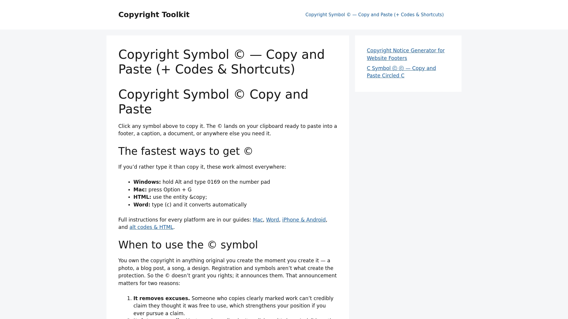
From there, the notice templates and brand documentation resources at Copyrighttoolkit give you a ready framework to adapt for logo files, export packets, and client deliverables. Visit Copyrighttoolkit to grab the symbol, copy a template, and get the notice right the first time.
Useful sources
- 17 U.S.C. § 401 — Copyright notice (Cornell Law School)
- 17 U.S.C. § 504 — Remedies for infringement (U.S. Code via House.gov)
- Circular 3 — Copyright notice (U.S. Copyright Office)
- Chapter 4 — Copyright Notice, Deposit, and Registration (U.S. Copyright Office)
- Trademark and copyright symbols (Practical Typography)
- Copyright and trademark symbols: when to use each (Dictionary.com)